Design
Logo, color, type, and real photography — one system.
The logo
A retro script wordmark — bold 1950s-athletic letters, a swoosh underline, a paw-and-sparkles crown, and a “· PET CARE ·” badge. Playful-vintage and confident.
 On light On canvas
 - The script is artwork, not a font — it lives only inside the logo files and is never typeset.
- Don’t recolor, stretch, add effects, or crop the paw-and-sparkles crown.
- Purple-family, white, or black fields work; busy photos need a scrim.
Color
One palette, anchored on Premier Violet — the one color the portal and the print flyer already share. One purple ramp, one neutral, one signature gradient.
Lead
Purple Ramp
Neutral
Supporting
Signature Gradient
linear-gradient(135deg, #7C3AED, #A855F7) The one brand gradient, digital and print. The portal's CTA fill; print's existing "Linear" swatch confirms print already gradients — unify on this exact one. At most one gradient-filled element per card or form.
- At most one gradient-filled element per card, two per page. The gradient is a spotlight, not a wash.
- Lavender and Bright Violet never carry body text on white — they fail contrast. Ink is the text color on light.
- Midnight is for large dark fields only (nav, heroes) — it is not the brand’s black.
The palette doing its job.
Typography
Plus Jakarta Sans is the brand’s one typeface — a geometric-humanist sans, weights 400–800. Never 300 or 900. When in doubt: one size bigger, one weight heavier than body.
Plus Jakarta Sans
The Premier Paws effect: less stress and more peace.
The Premier Paws effect: less stress and more peace.
The Premier Paws effect: less stress and more peace.
The Premier Paws effect: less stress and more peace.
The Premier Paws effect: less stress and more peace.
Display
Heading 1
Heading 2
Body text — real clinical detail, never watered down. Licensed veterinary technician ("vet nurse").
Secondary text — timestamps, captions, helper lines.
Photography
The standard is real candid photos — phone photography of actual pets mid-walk, mid-boop, mid-recovery. No stock, no studio. The feed reads like a trusted person’s camera roll with brand-purple accents.
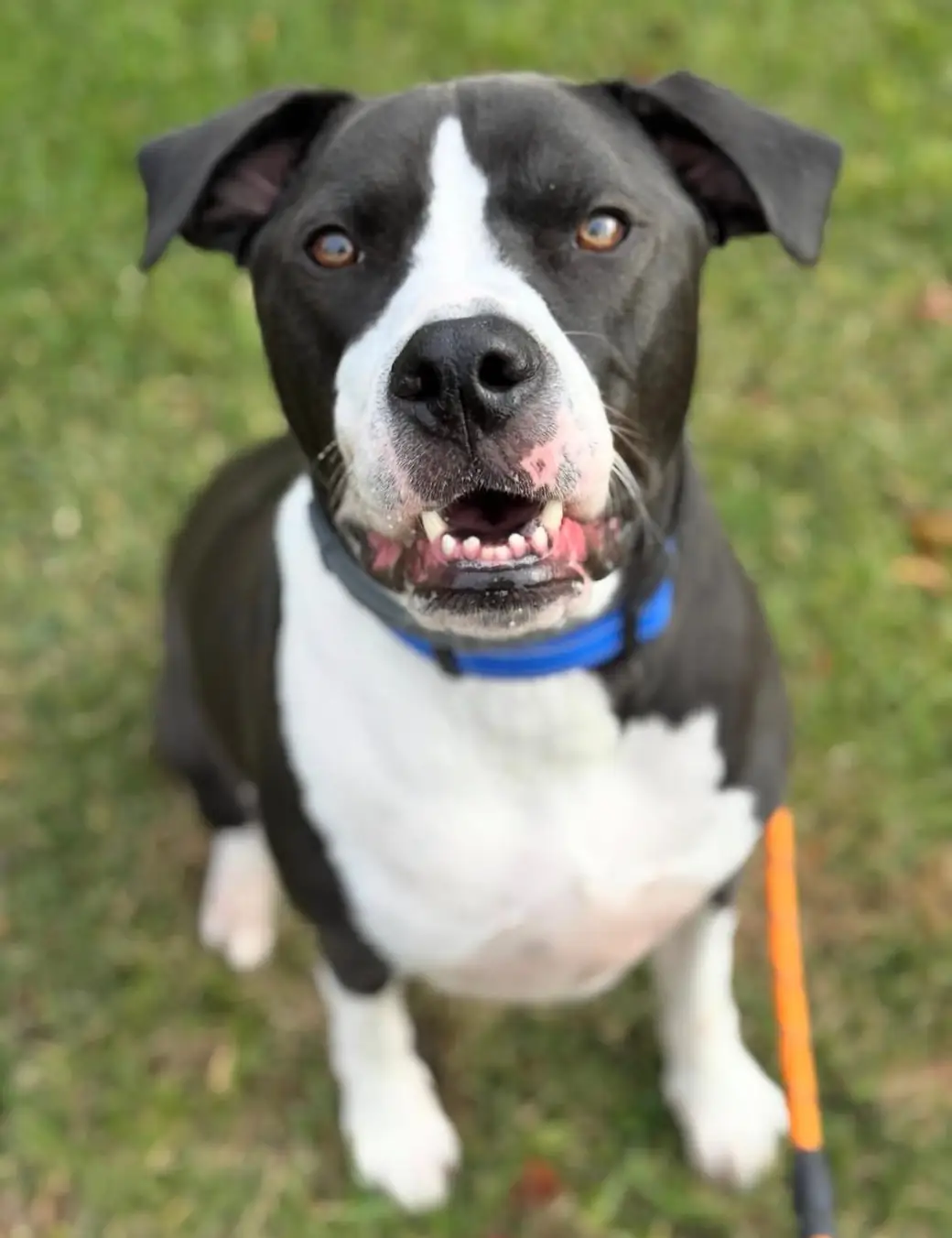
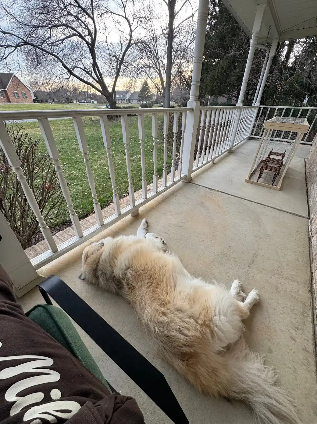
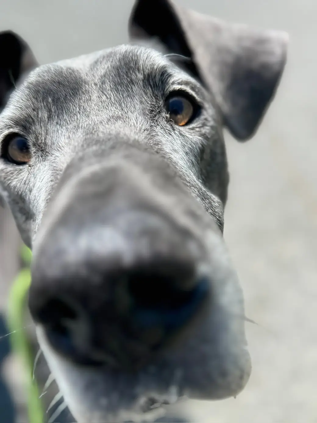
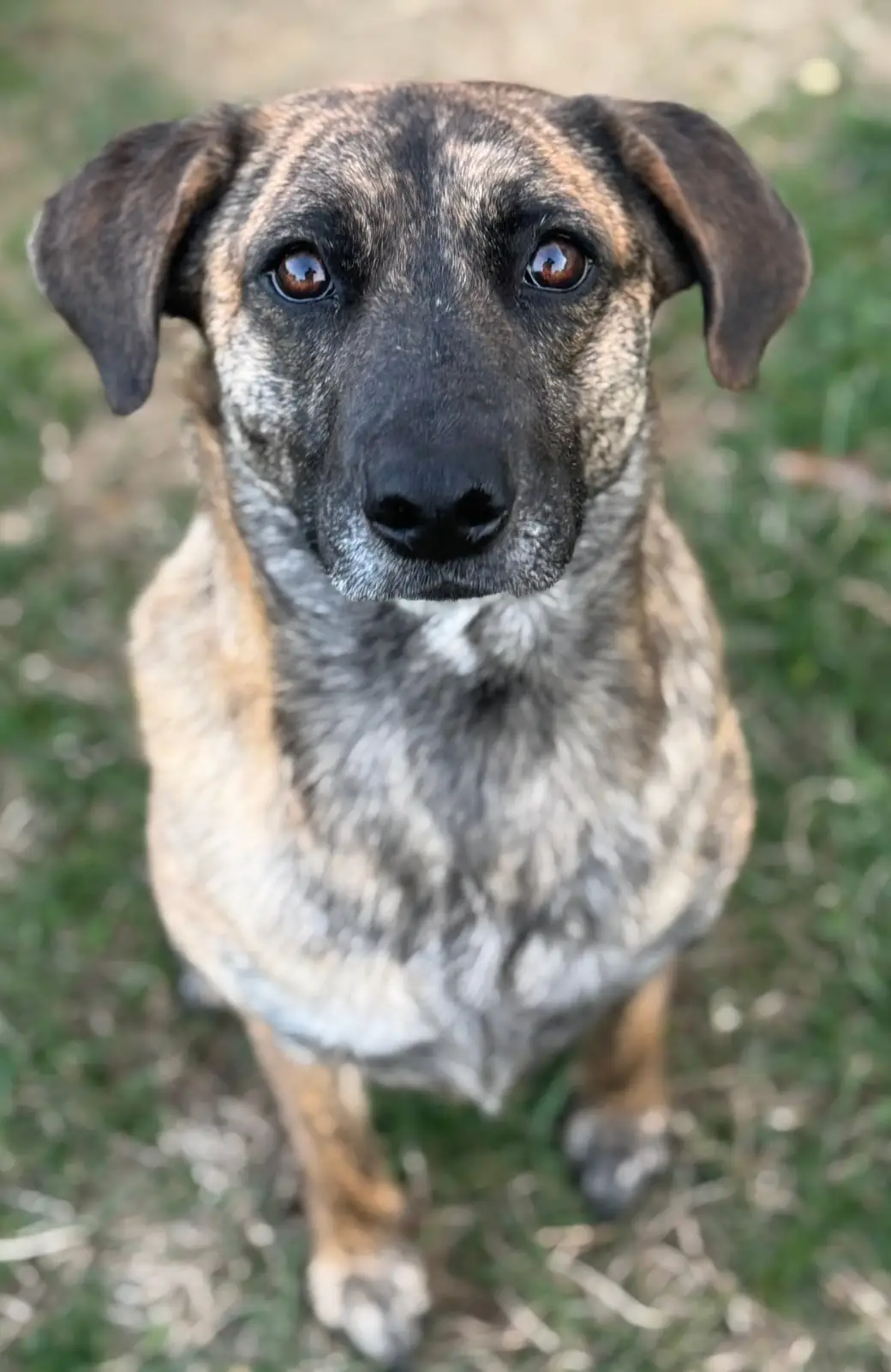
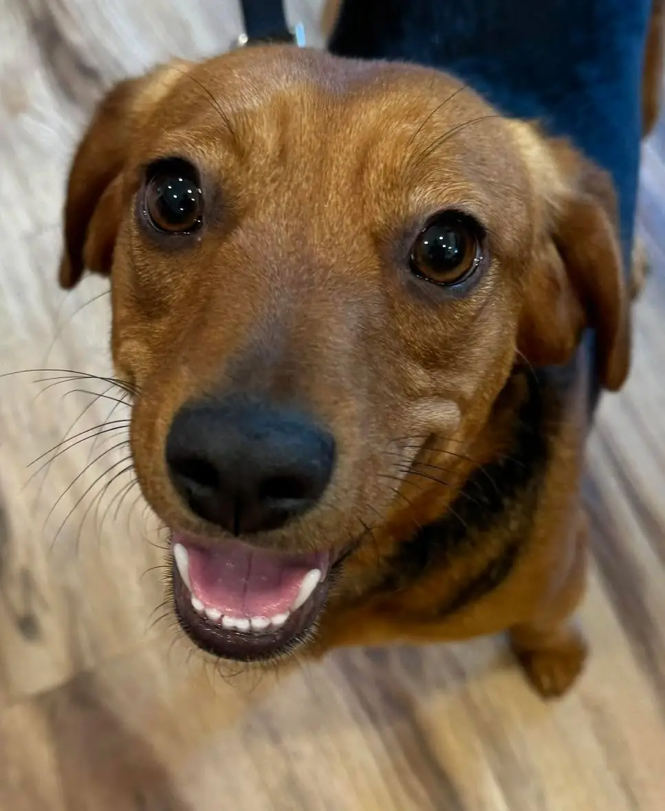
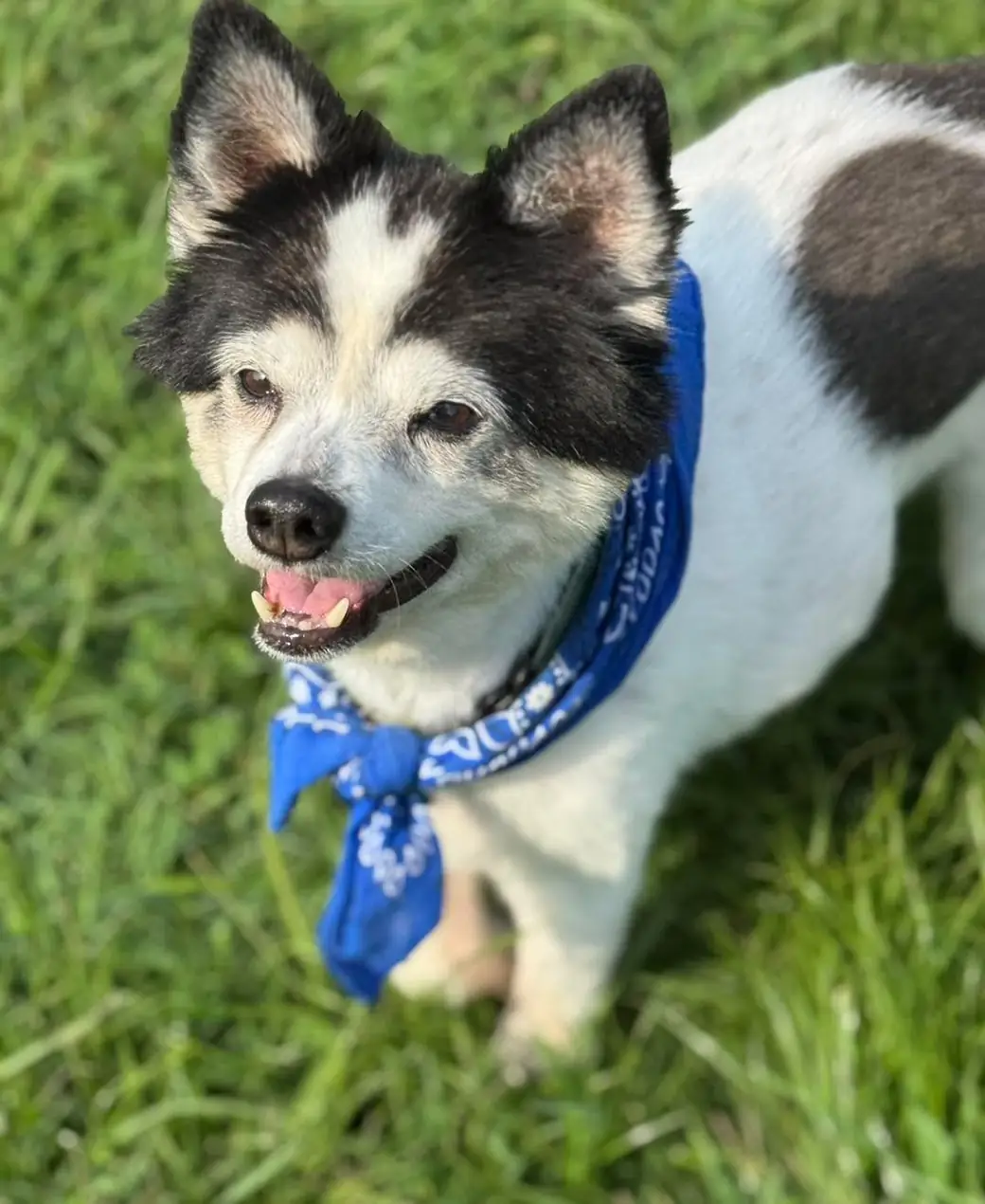
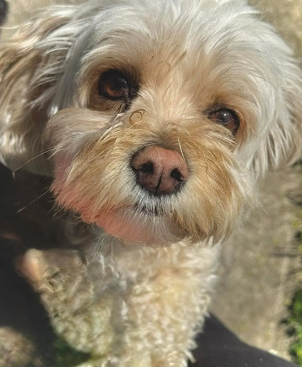
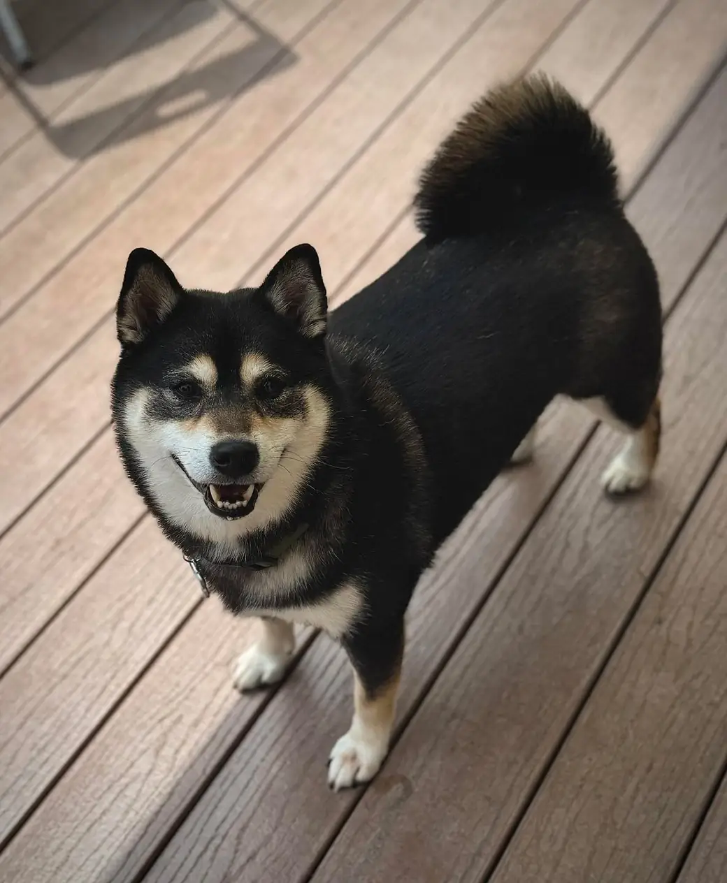
- The pet is the subject and looks comfortable — loose body, soft eyes, natural setting.
- Real context: home floors, porches, trails, the car harness. Not staged perfection.
- Team photos: purple shirts, genuine mid-work smiles, no stiff posing.
Do / Don’t
Anchor every surface on Premier Violet with generous white and lavender space.
Mix a second purple system into new materials.
Use the signature gradient on at most one element per card.
Gradient every button, header, and divider.
Real candid photos of comfortable pets.
Stock pets, AI-generated pets, or stressed animals.
Ink for text on light; Paper knockout on dark fields.
Pure black text, or lavender body text on white.
Lucide icons, stroke 1.5, consistent sizes.
Emoji in UI, mixed icon sets, or decorative clip art.
Iconography
Lucide is the only icon library. Stroke 1.5 on light, 2 on dark. Sizes 14 / 16 / 20 / 24.